GOOGLE'S UX DESIGN CERTIFICATE
Mobile App Prototype
Overview
Project: The Andy Museum, Mobile App Prototype
Role: Team Lead, Visuals, Interactive
Duration: June 2024 – August 2024
The Google UX Design Certificate is a hands-on program covering the full UX process, from user research and wireframing to prototyping and usability testing in Figma. The Andy Museum was one of three portfolio projects I built to complete it.
Process DeckThe Goal
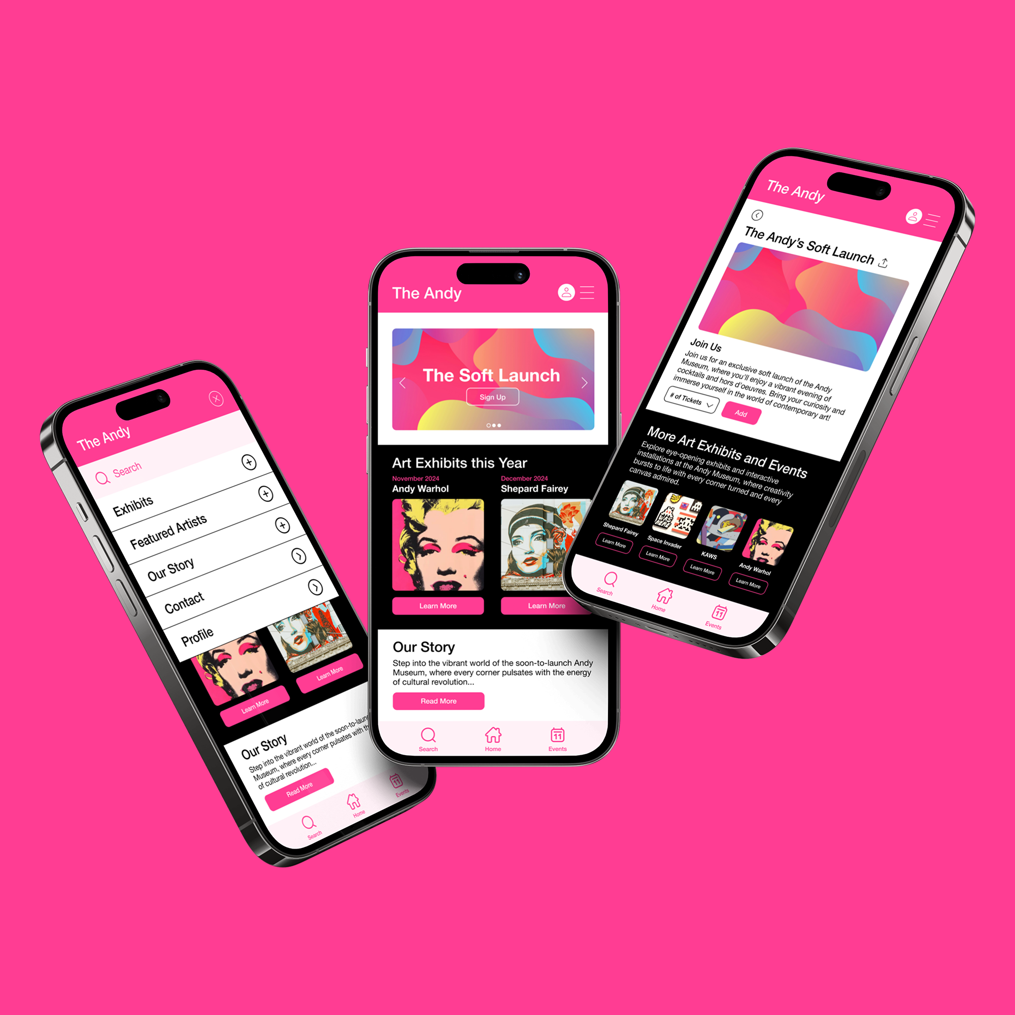
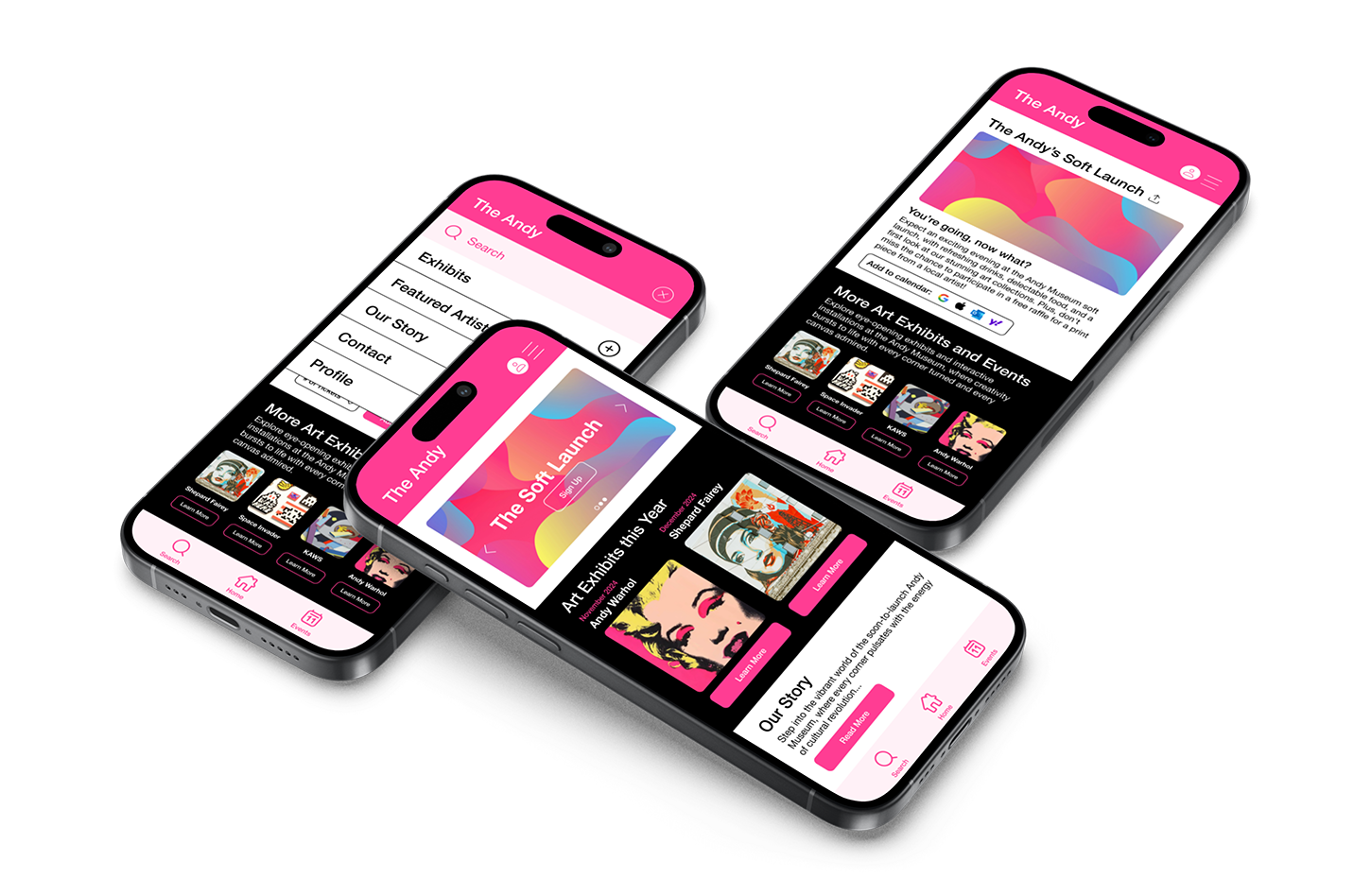
I designed a mobile app prototype for The Andy Museum, a fictional public art museum in the San Francisco Bay Area. The app helps the museum advertise exhibitions and events, share visitor information, and facilitate easy scheduling. It targets all ages interested in art and community.
Project Vision
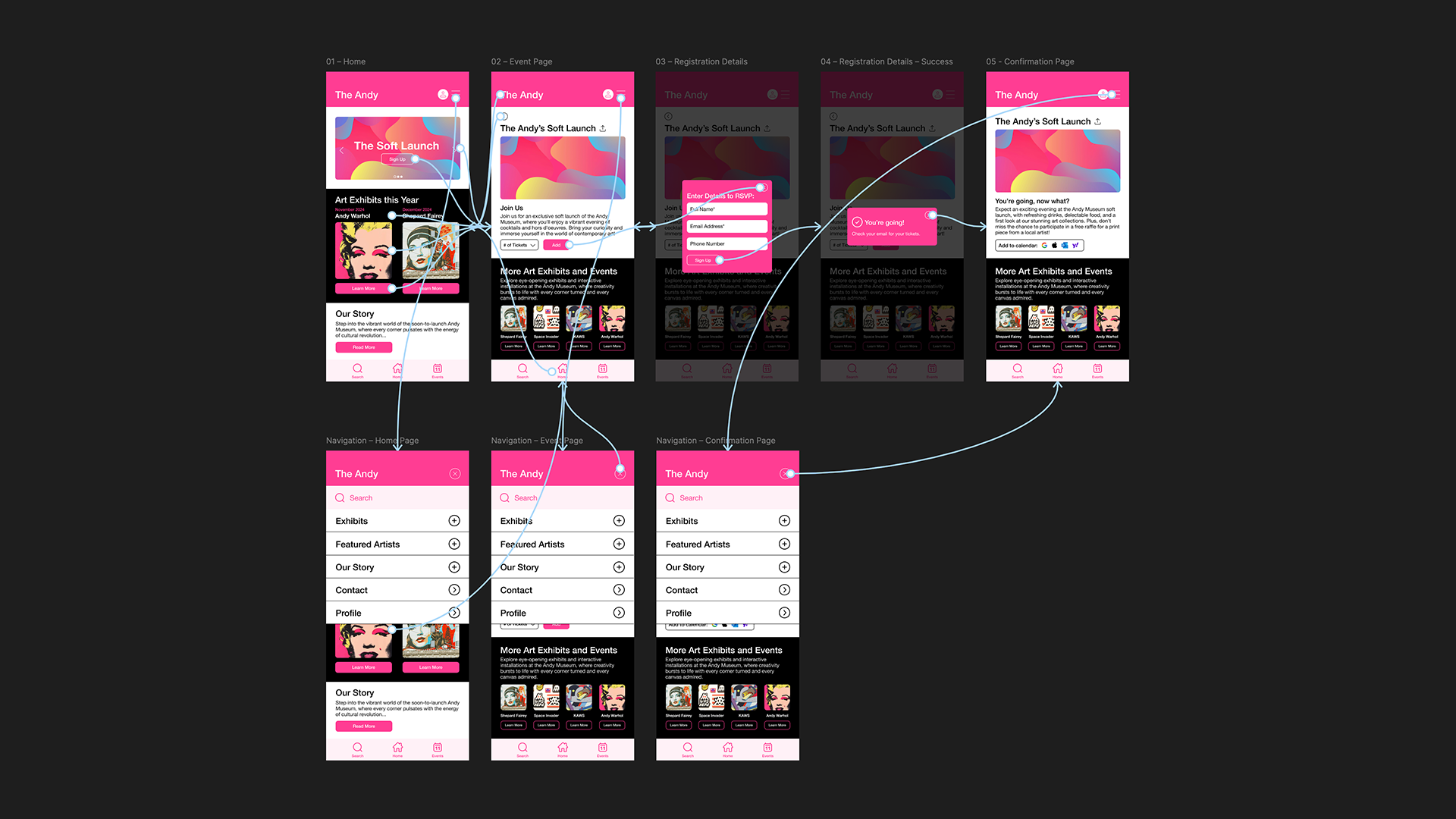
I designed the app to give users a seamless way to explore exhibits and events, register with a couple of taps, and add events straight to their calendar. The vibrant, welcoming design invites everyone to experience the museum's offerings.
Challenges
1. Create a clear user flow for registering for an exhibit or event.
2. Design a UI that is visually inviting and easy to navigate for all users.
User Research: Personas
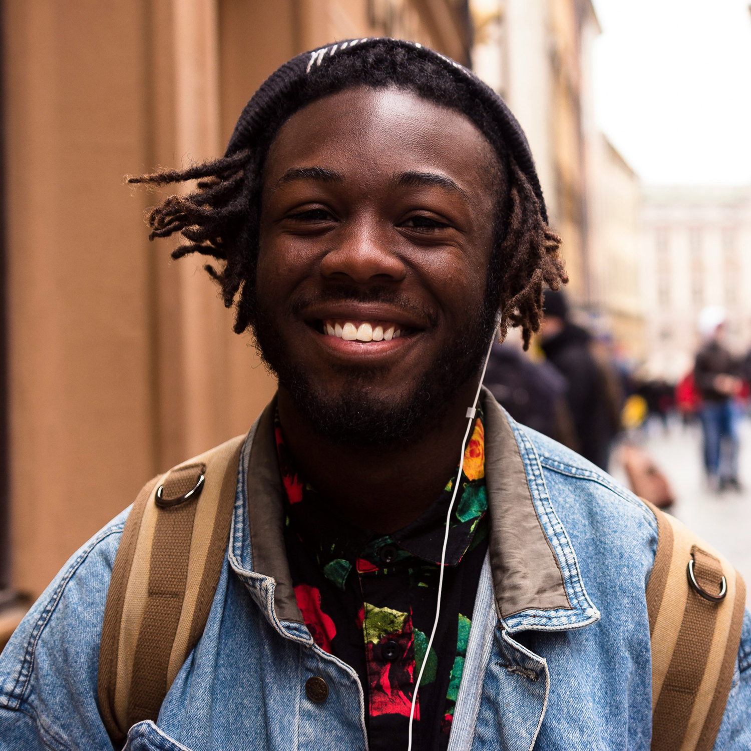
Jasper, 35
Creative Director at AI startup. Loves art and design for inspiration. Visits local museums with family. Wants to find new museum info and easily schedule events in busy calendar.

Sophia, 23
Writer with appreciation for art and design. Recently relocated to Oakland. Eager to learn about newly opened museums and seeks efficient way to register for exhibitions and events.
Competitive Audit
I analyzed popular museums' event registration flows and UX. My key findings: dense information, well-designed nav bars, appealing homepages, and limited language accessibility.
Wireframes & Low-Fidelity Mockups
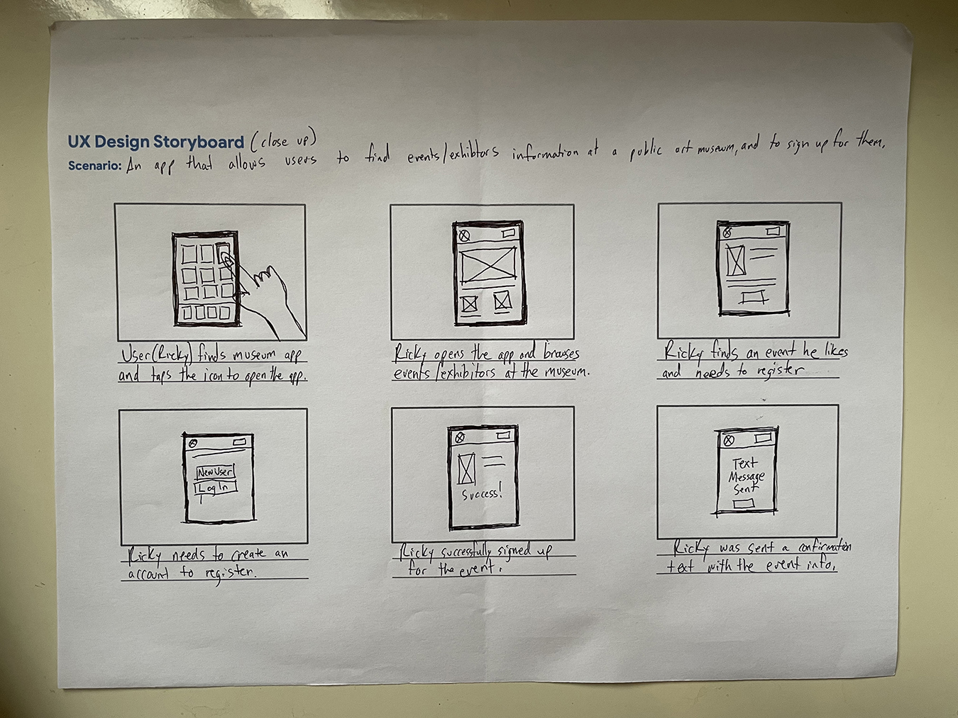
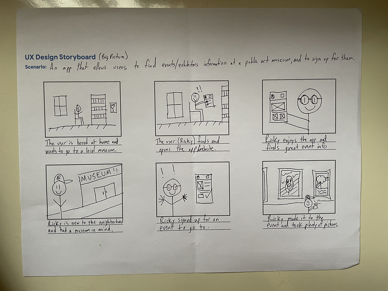
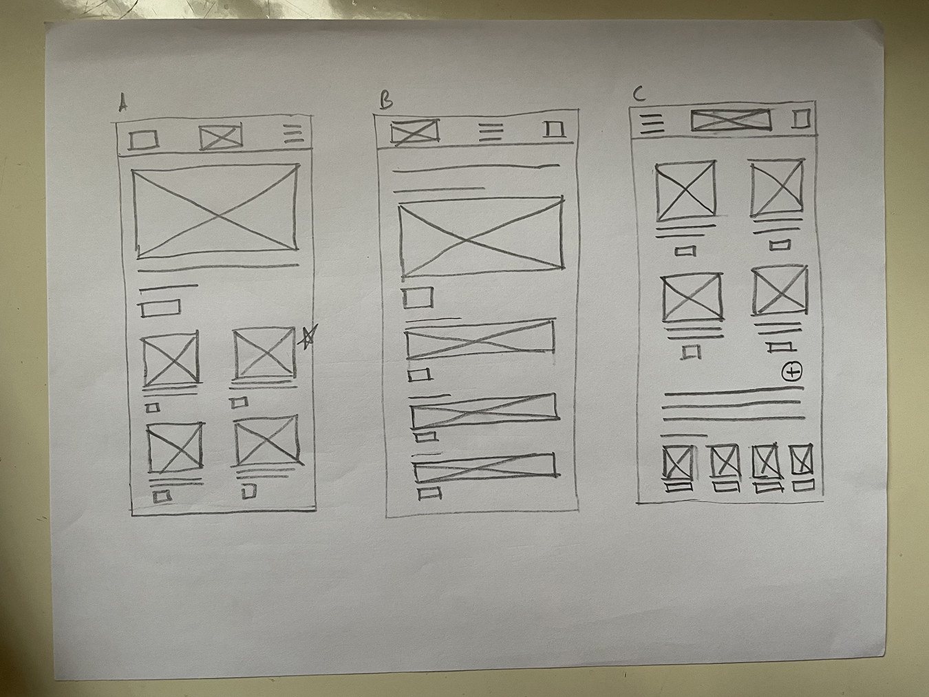
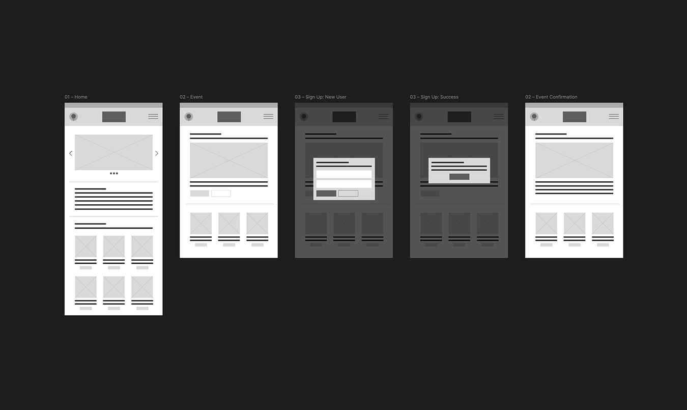
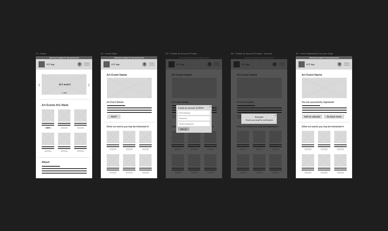
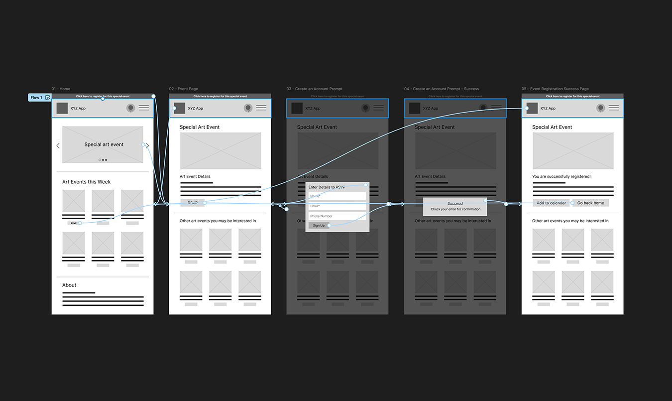
Usability Testing: Common themes from colleagues and friends included the need to clearly indicate which buttons advance to next screen, option to register without creating account, and removal of misleading alert bars lacking functionality.
The Final Product: App
Usability studies were crucial in helping me understand user needs, behavior, and frustrations. By listening and observing, I made thoughtful changes to ensure the product truly resonated with the audience.
Conclusion: App
This project was my formal introduction to UX design, and I loved every part of it: conducting real user research, running competitive audits, and iterating through wireframes and prototypes based on actual feedback. Learning Figma's deeper features rekindled my energy as a designer, and it left me eager to keep building.
Website Prototype
Overview
Project: The Andy Museum, Website Prototype
Role: Team Lead, Visuals, Interactive
Duration: August 2024
The Goal & Summary
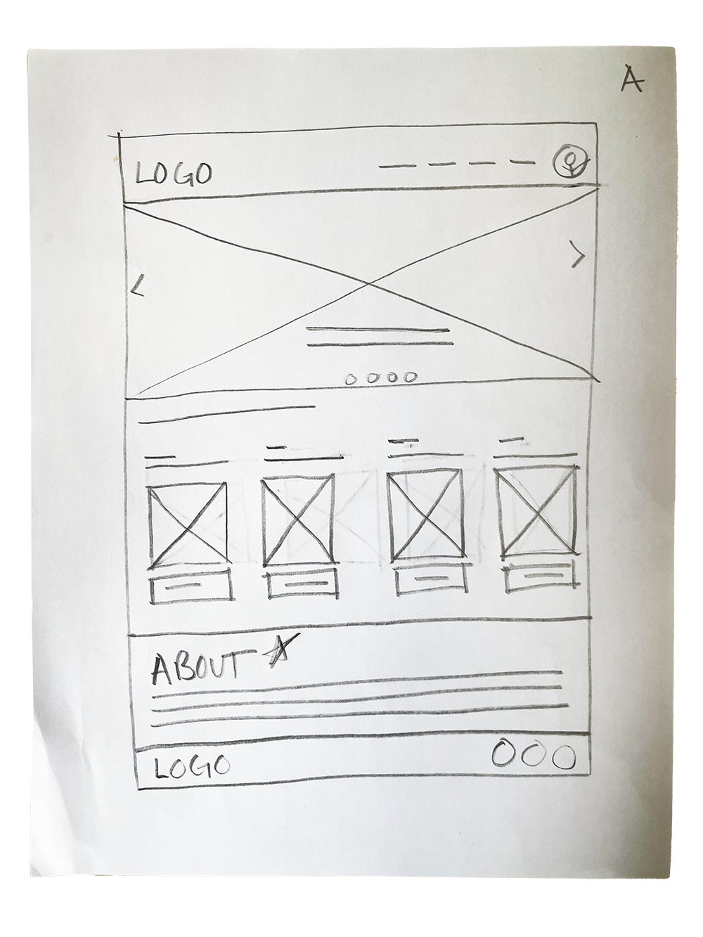
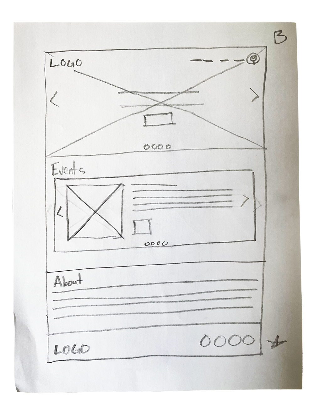
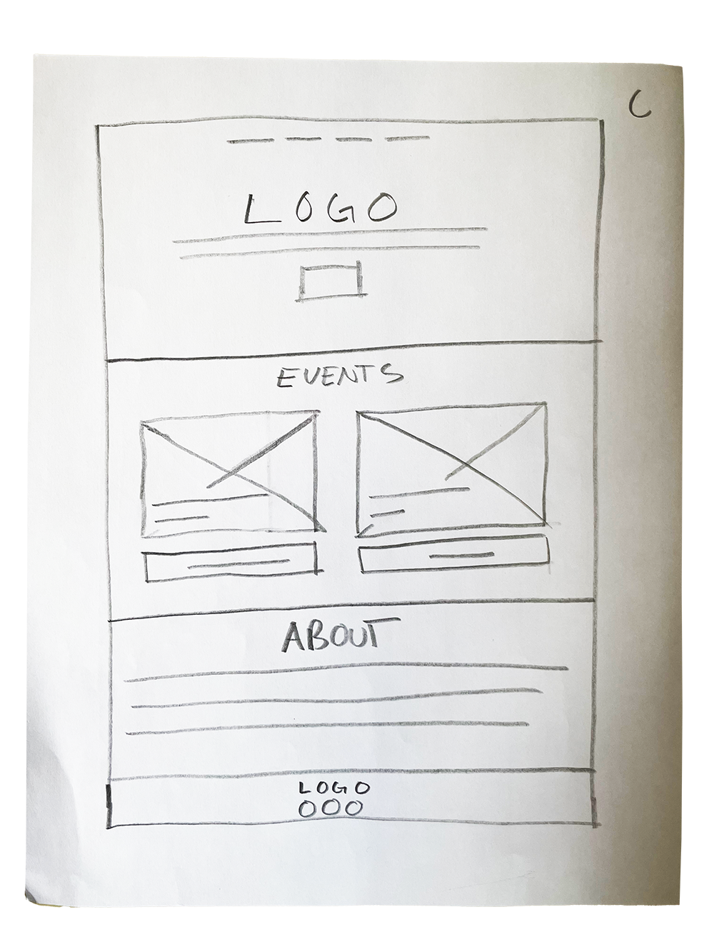
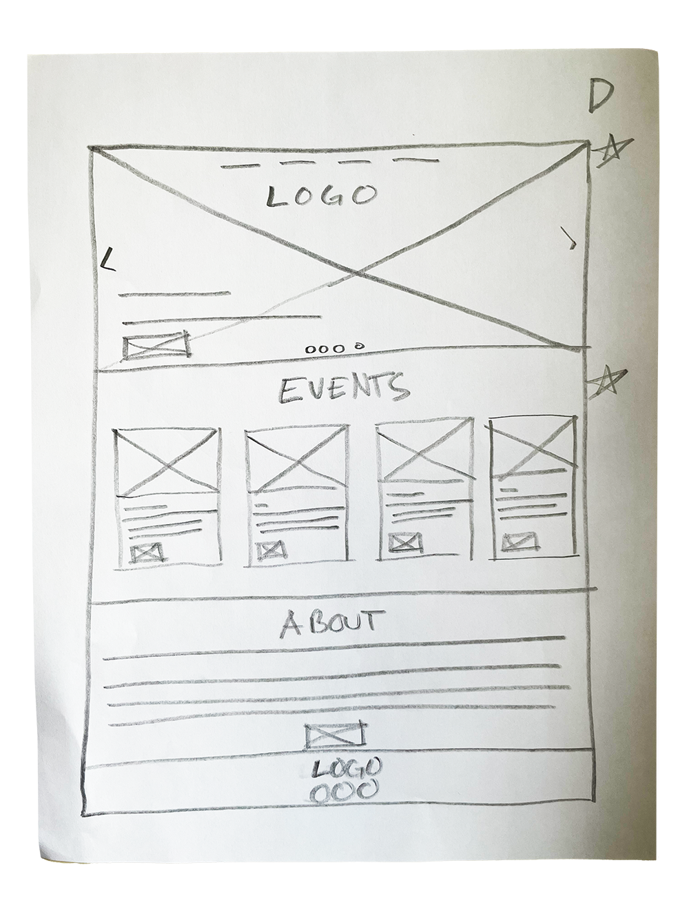
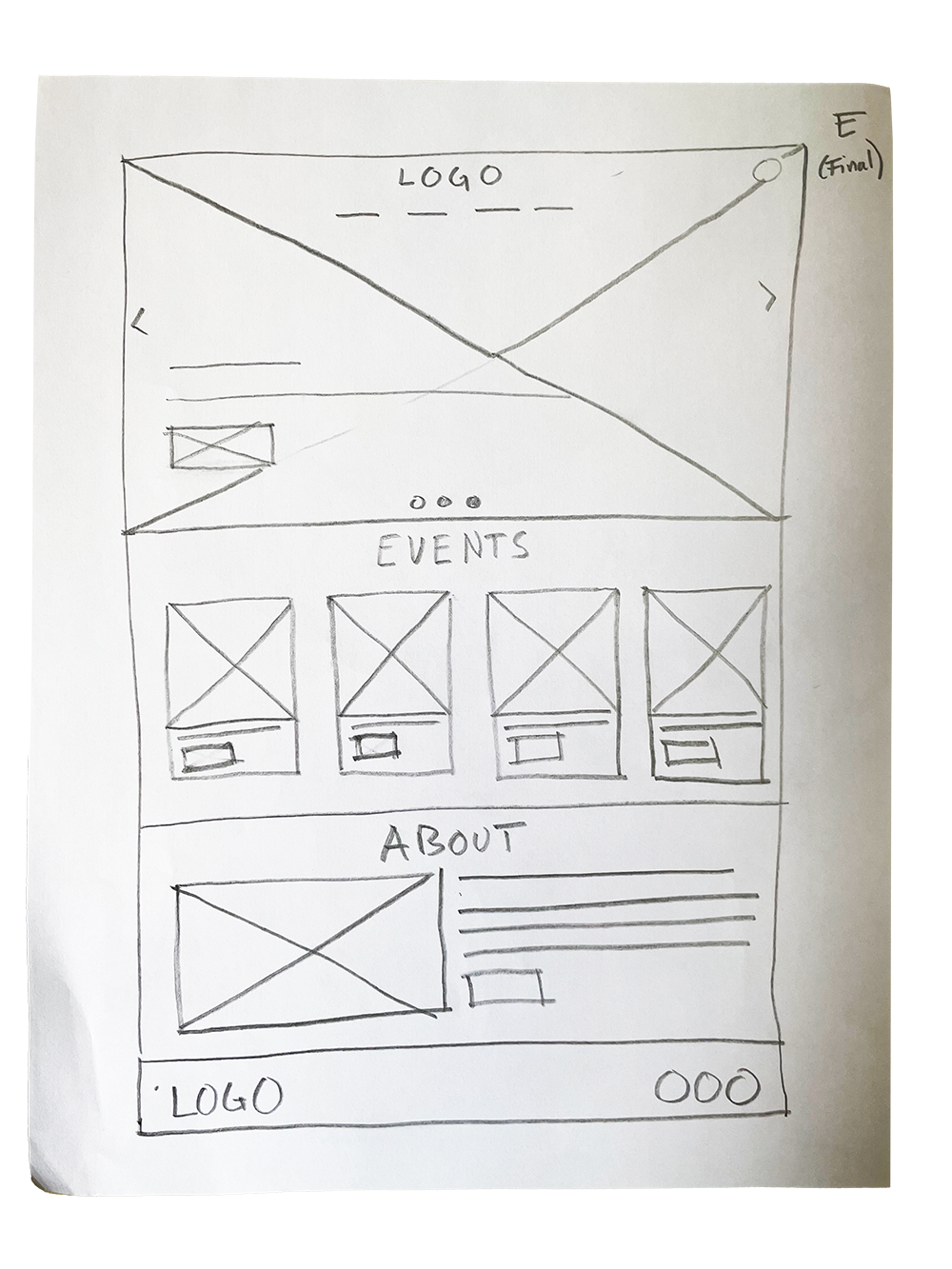
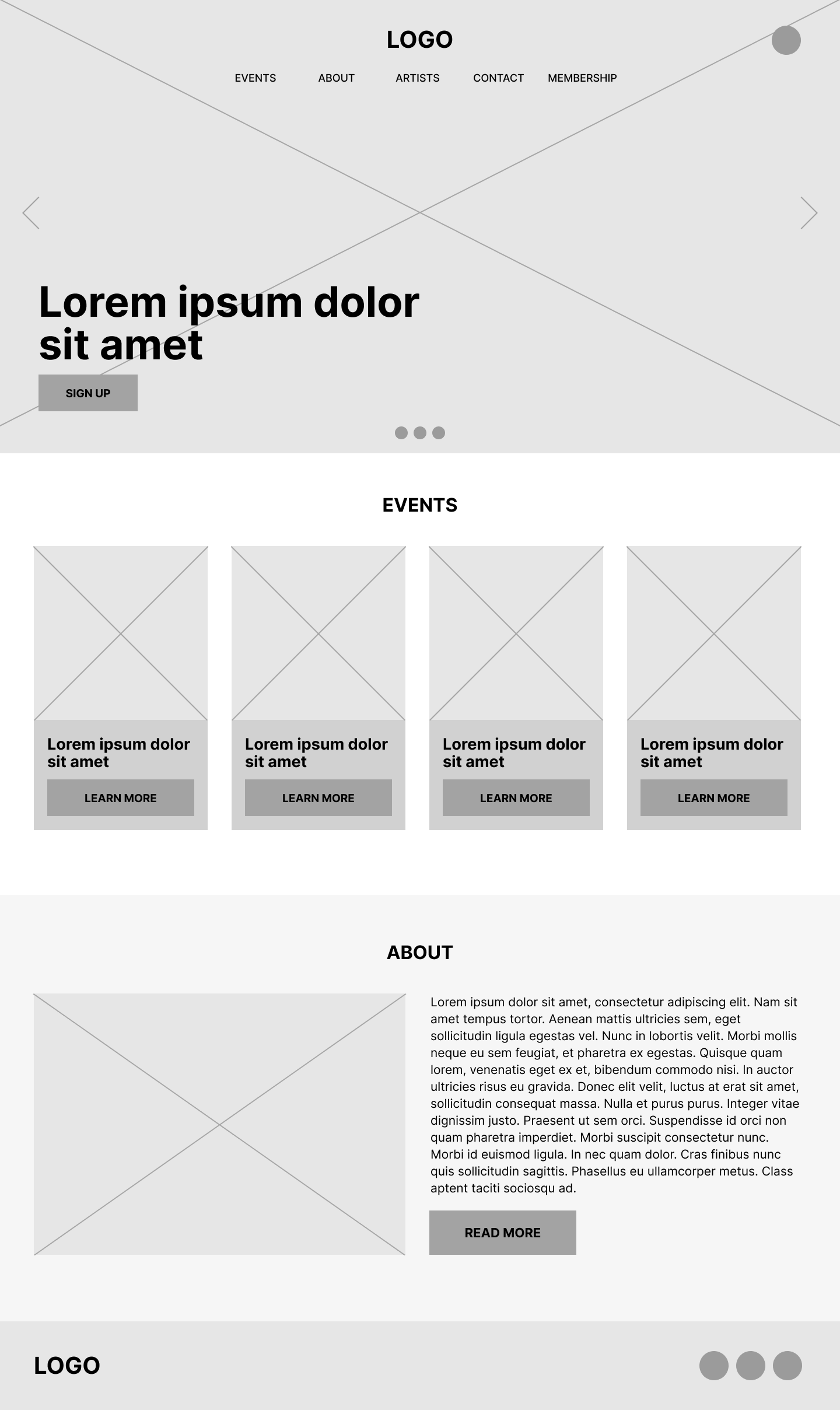
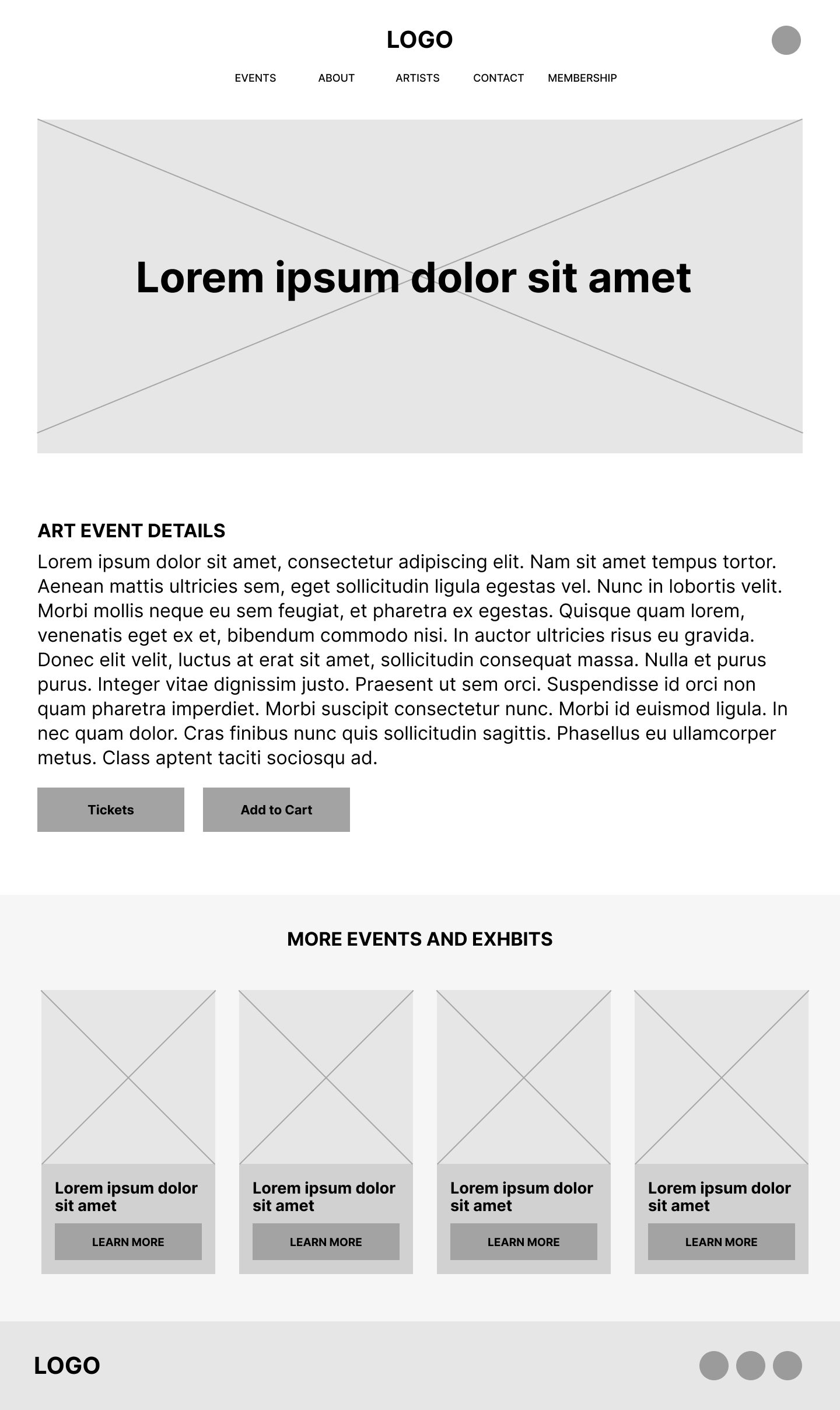
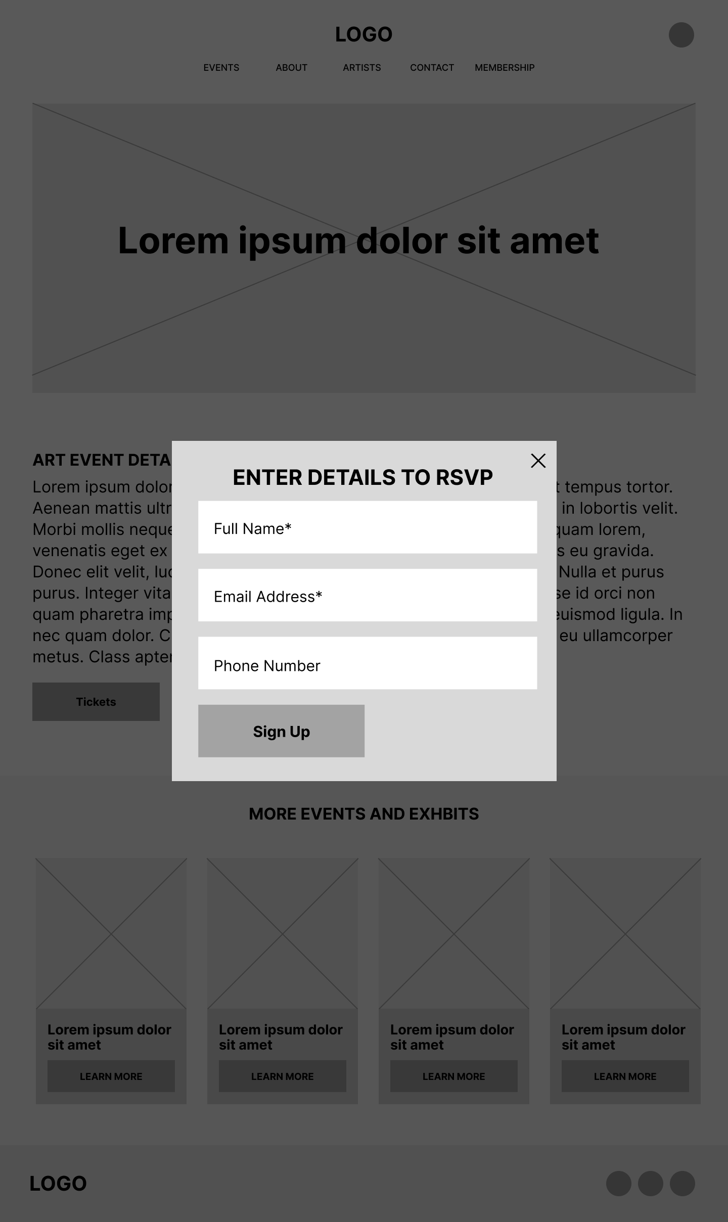
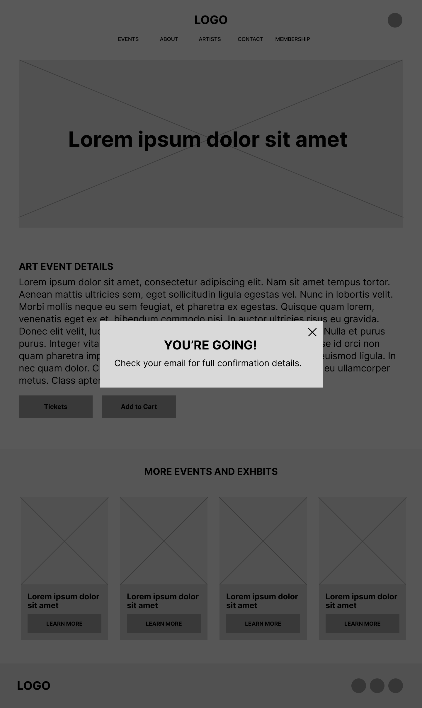
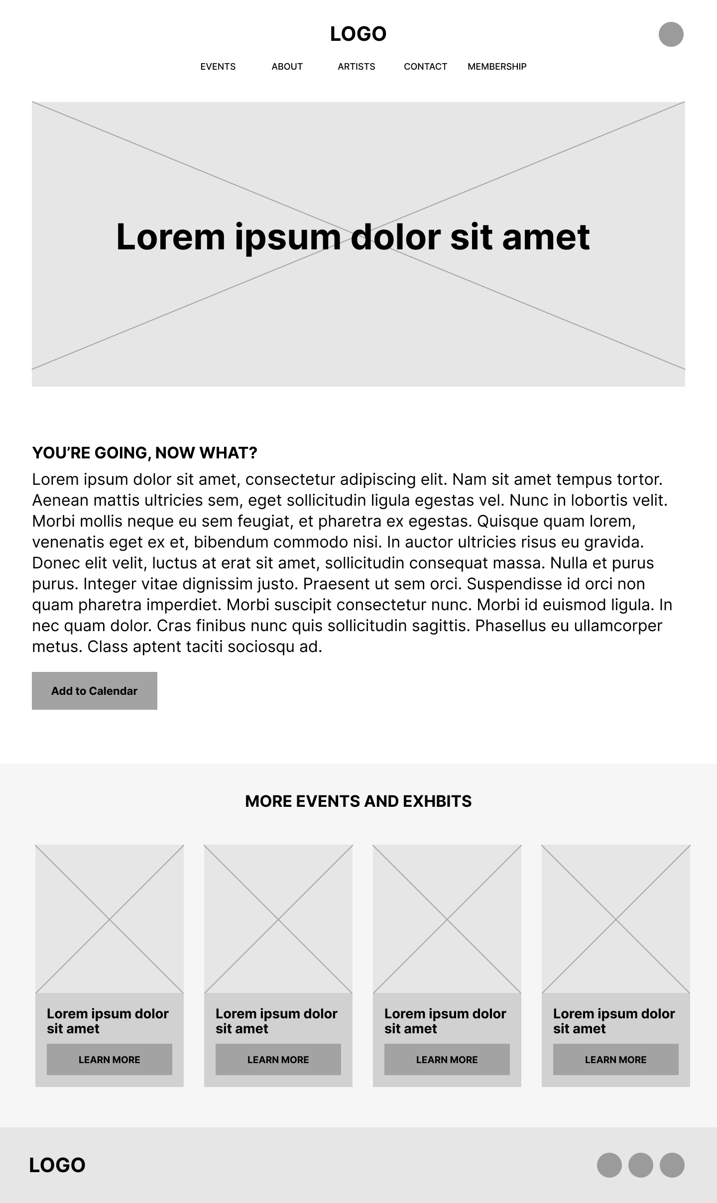
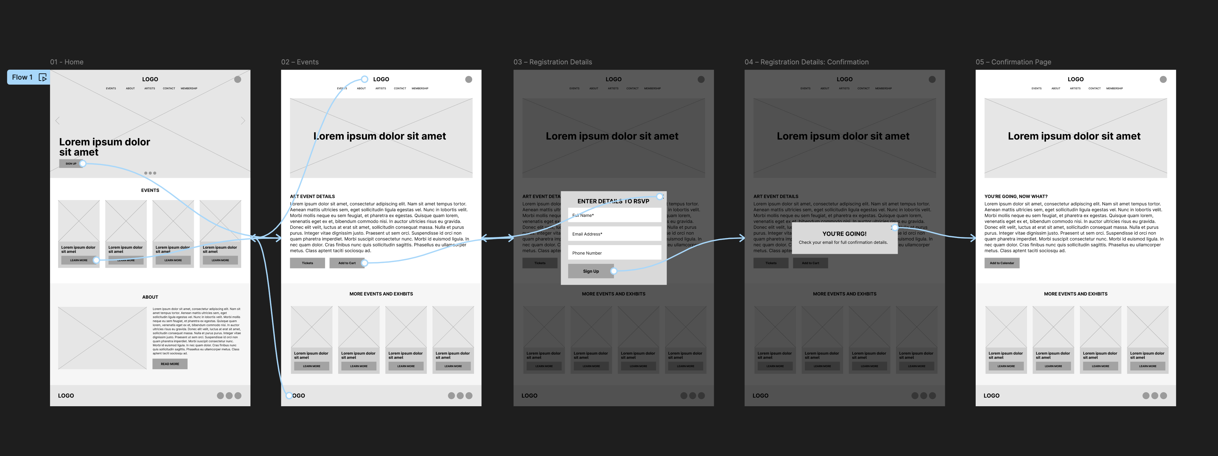
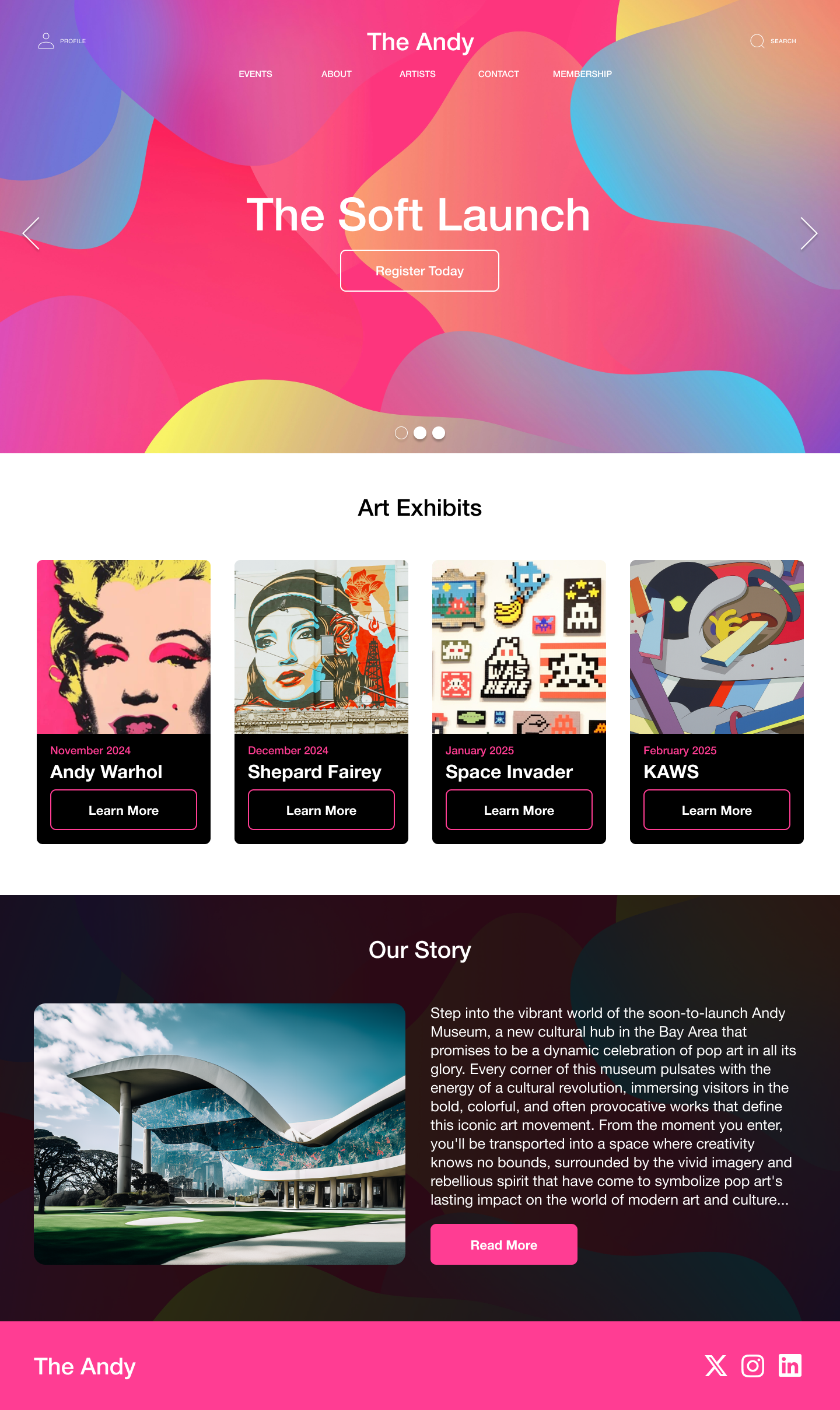
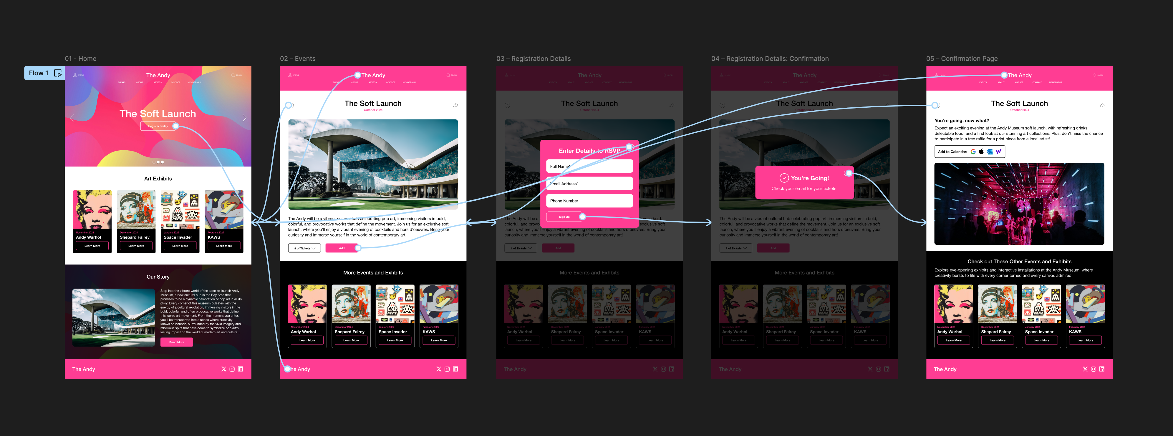
I designed a website prototype for The Andy Museum building on the mobile app. I created paper and digital wireframes, followed by low-fidelity and high-fidelity mockups, producing a high-fidelity desktop prototype. The visual identity emphasizes accessibility and functionality to enhance user experience.
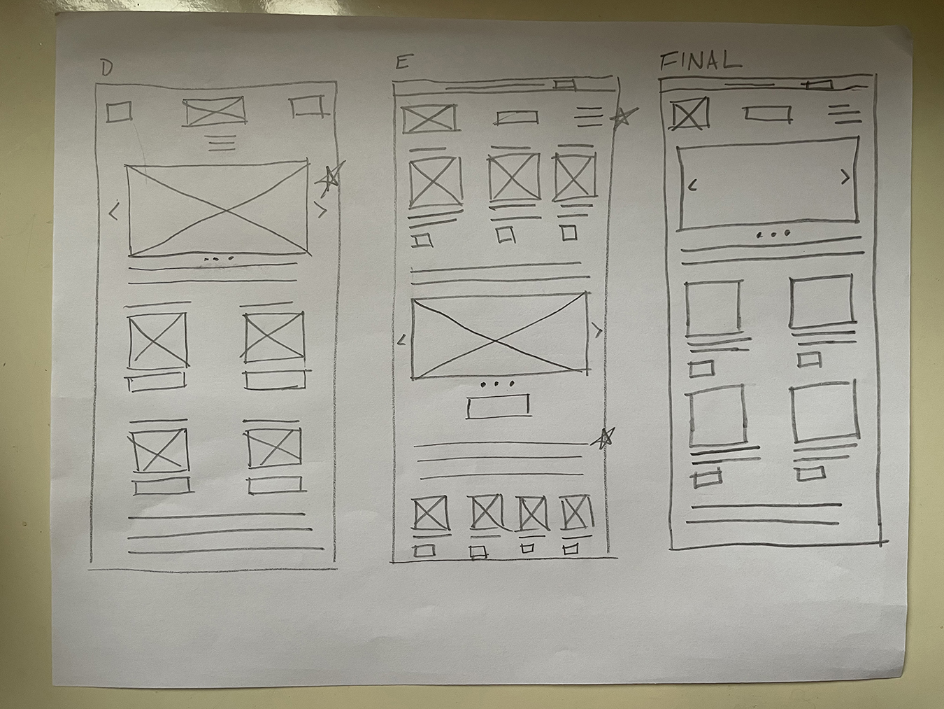
Paper Wireframes
Low-Fidelity Wireframes & Mockups
{{ currentImage.caption }}
Design Strategy
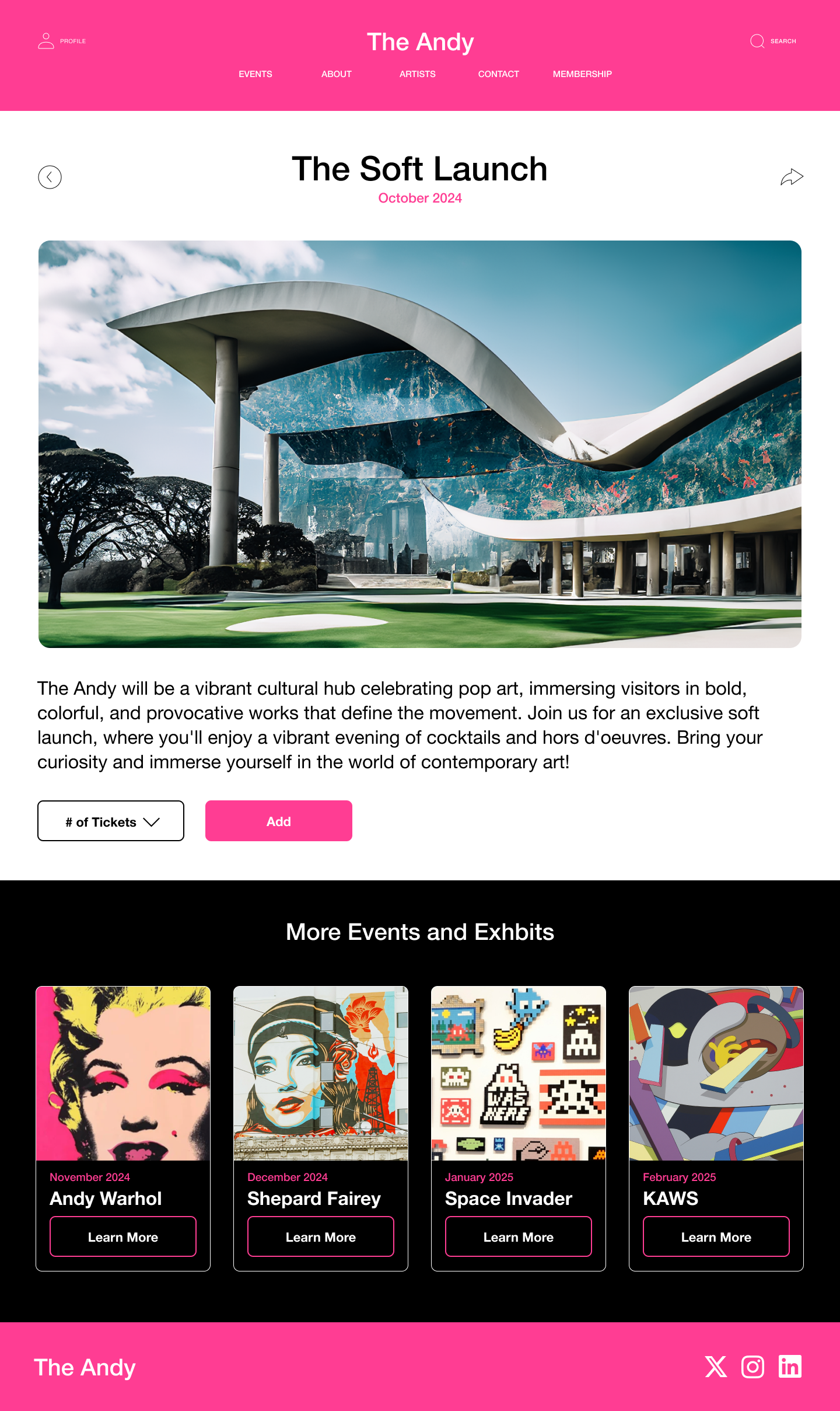
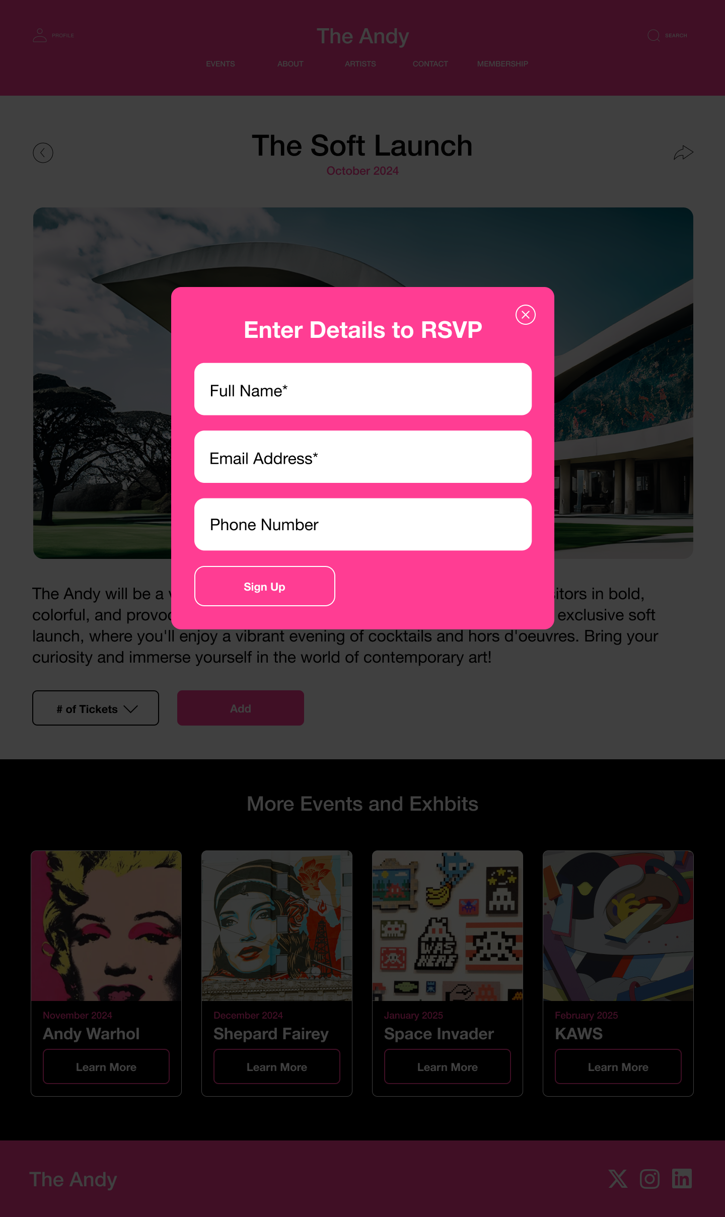
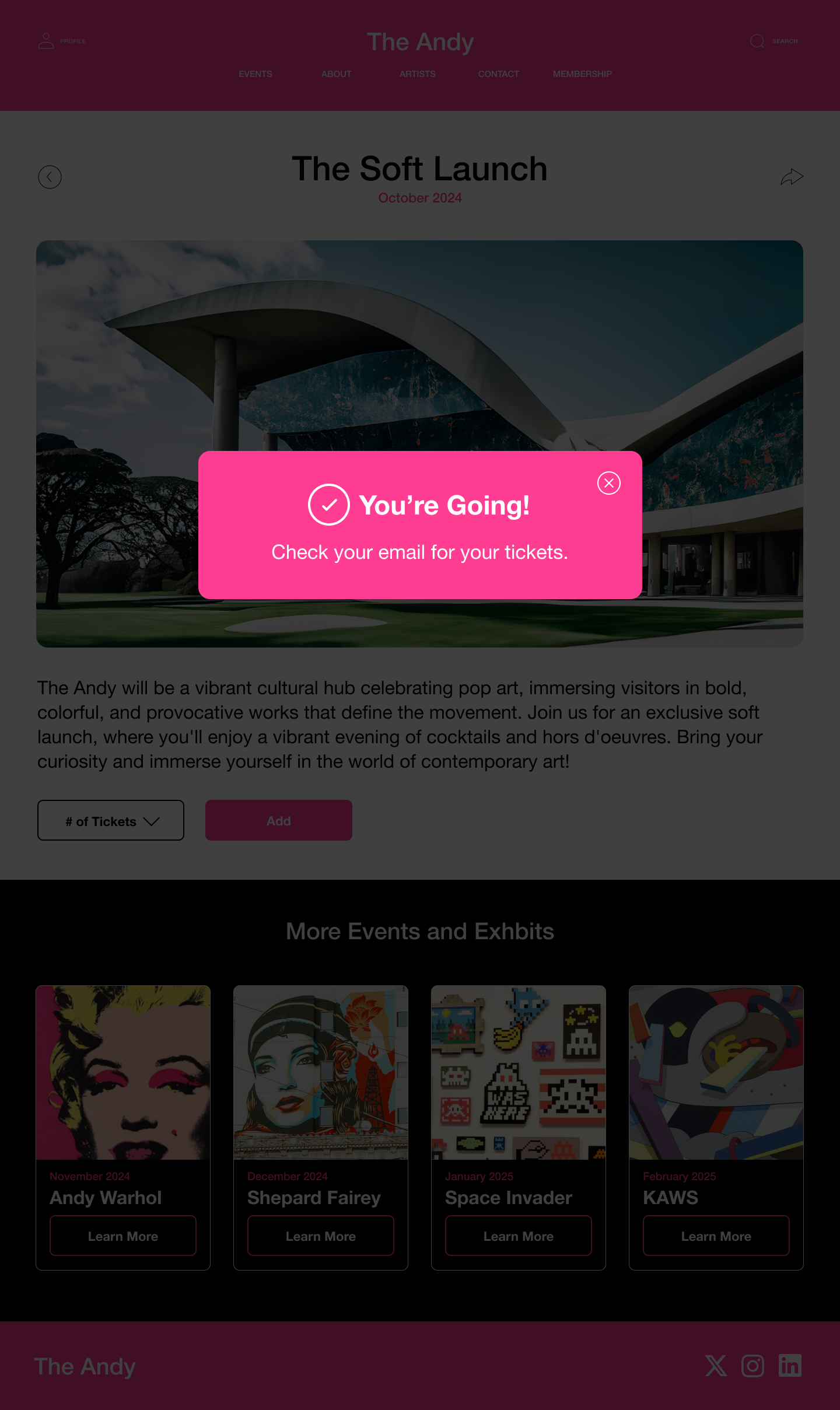
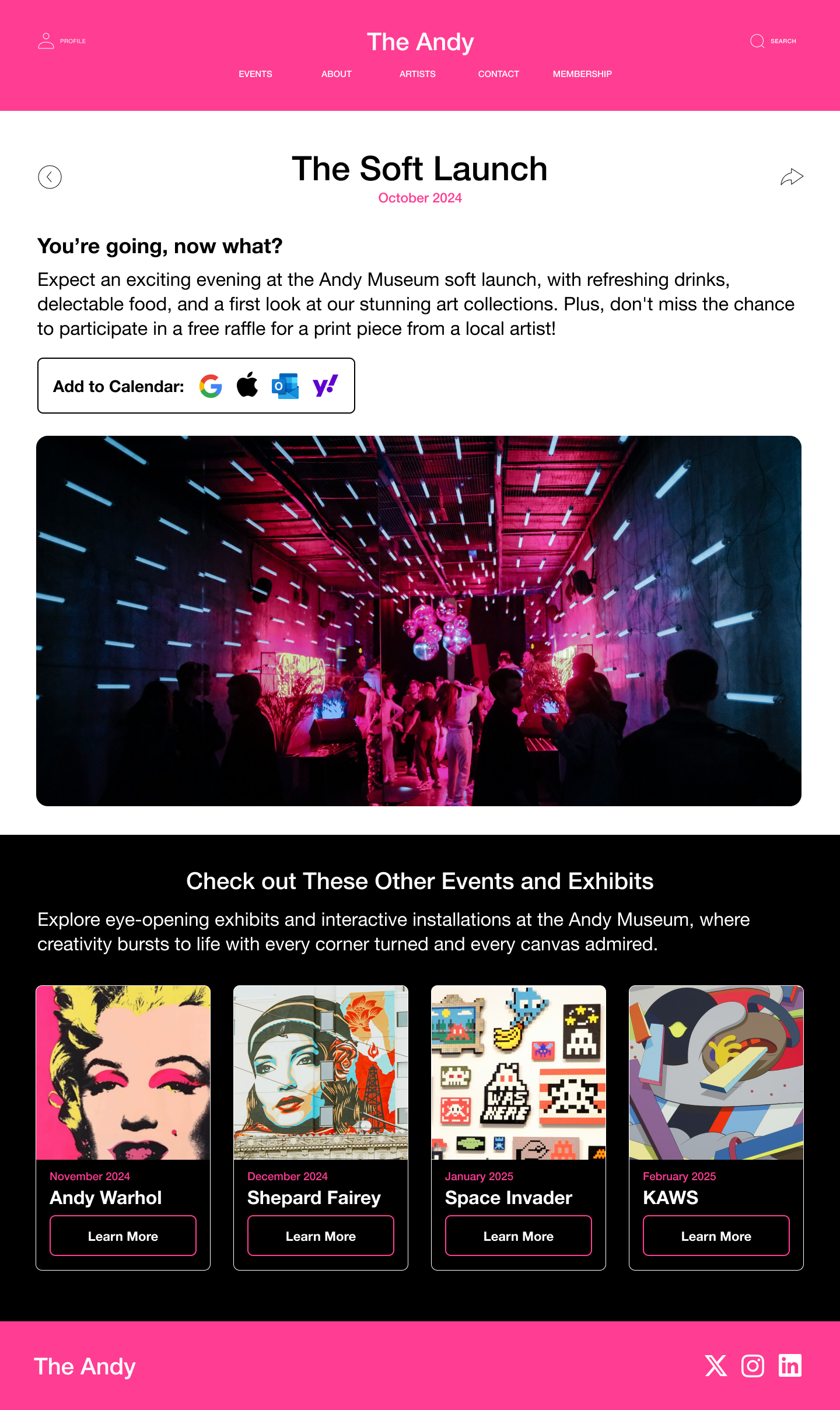
The strategy maintained consistency with the app prototype's user flow while creating a unique visual identity aligned with The Andy's brand. The familiar user experience was preserved through consistent interactions for adding tickets and checking out, culminating in a final confirmation page.
High-Fidelity Mockups & Prototype
Conclusion: Website
Building out the website version of The Andy's prototype was a rewarding experience. Scaling up the design meant thinking carefully about accessibility while keeping the visual identity consistent. It pushed my skills in building a prototype that was both functional and interactive, with a seamless experience for testing.