TUSK STRATEGIES REBRAND
Overview
Project: Tusk Strategies Rebrand
Role: Team Lead, Branding & Visuals
Duration: February 2022 – August 2022
Background
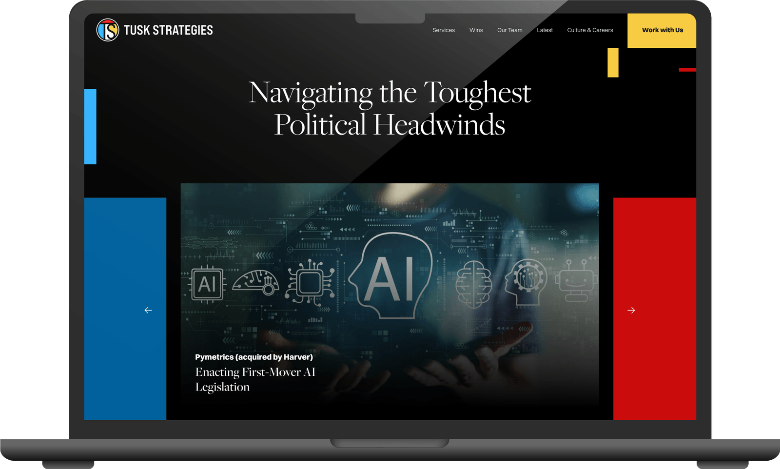
In 2022, I reimagined Tusk Strategies' logo and brand identity through months of research and competitive analysis. I designed their first official employee handbook and brand style guide, and partnered with Teal Media to craft a modern website that complements the new brand.
The Goal
I set out to craft a unique voice and strong brand identity for Tusk: a fresh logo, vibrant color palette, company documents, versatile templates, and a dynamic website. The rebrand mirrored Tusk's internal evolution: new practices, new clients, and a growing team.
Challenges
1. Create an edgy, timeless, and iconic logo that stands out and is easily recognizable.
2. Redesign the website with Teal Media on a five-month timeline.
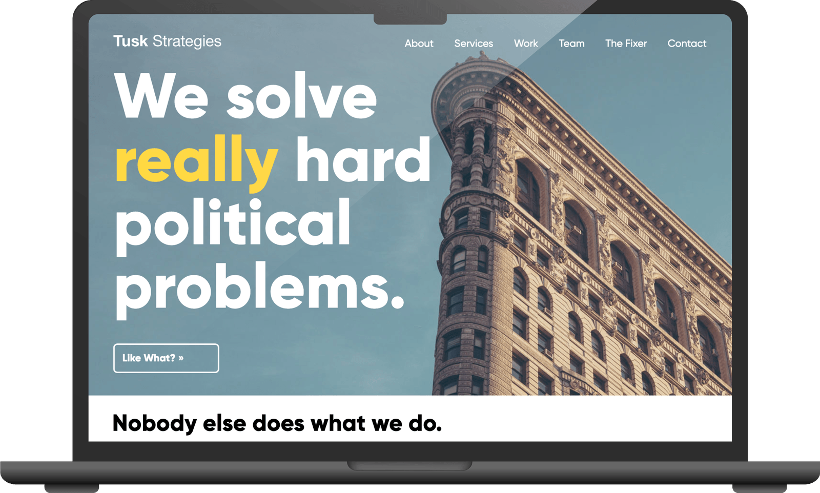
Old Logo and Website

Approach
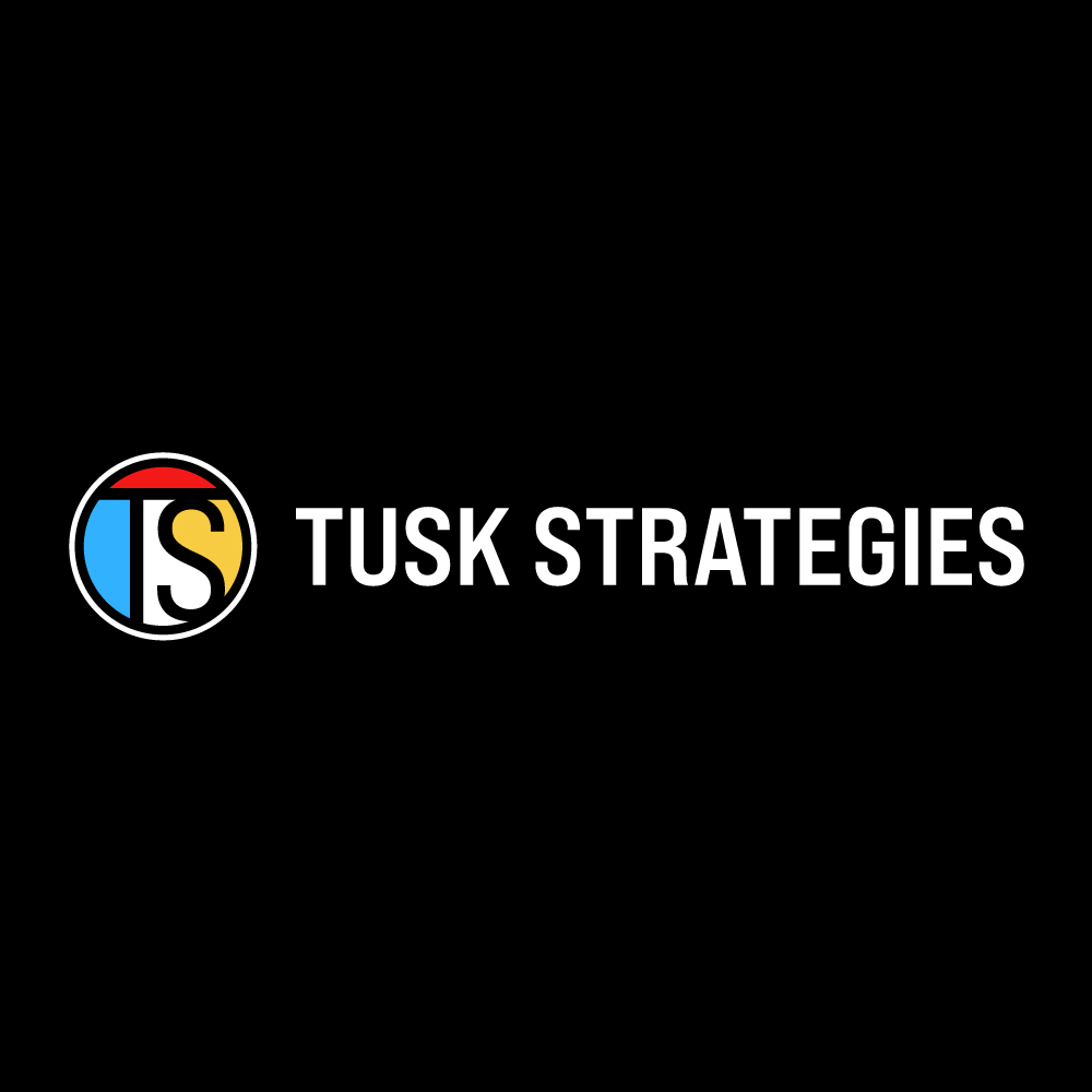
Through color, typography, and tone, I aimed to capture Tusk's tenacious, innovative, and fearless campaigning spirit, along with the intersectionality, collaboration, and creativity fundamental to their culture. The result is a logo that gives a complete picture of Tusk Strategies.
{{ currentImage.caption }}
Creative Vision
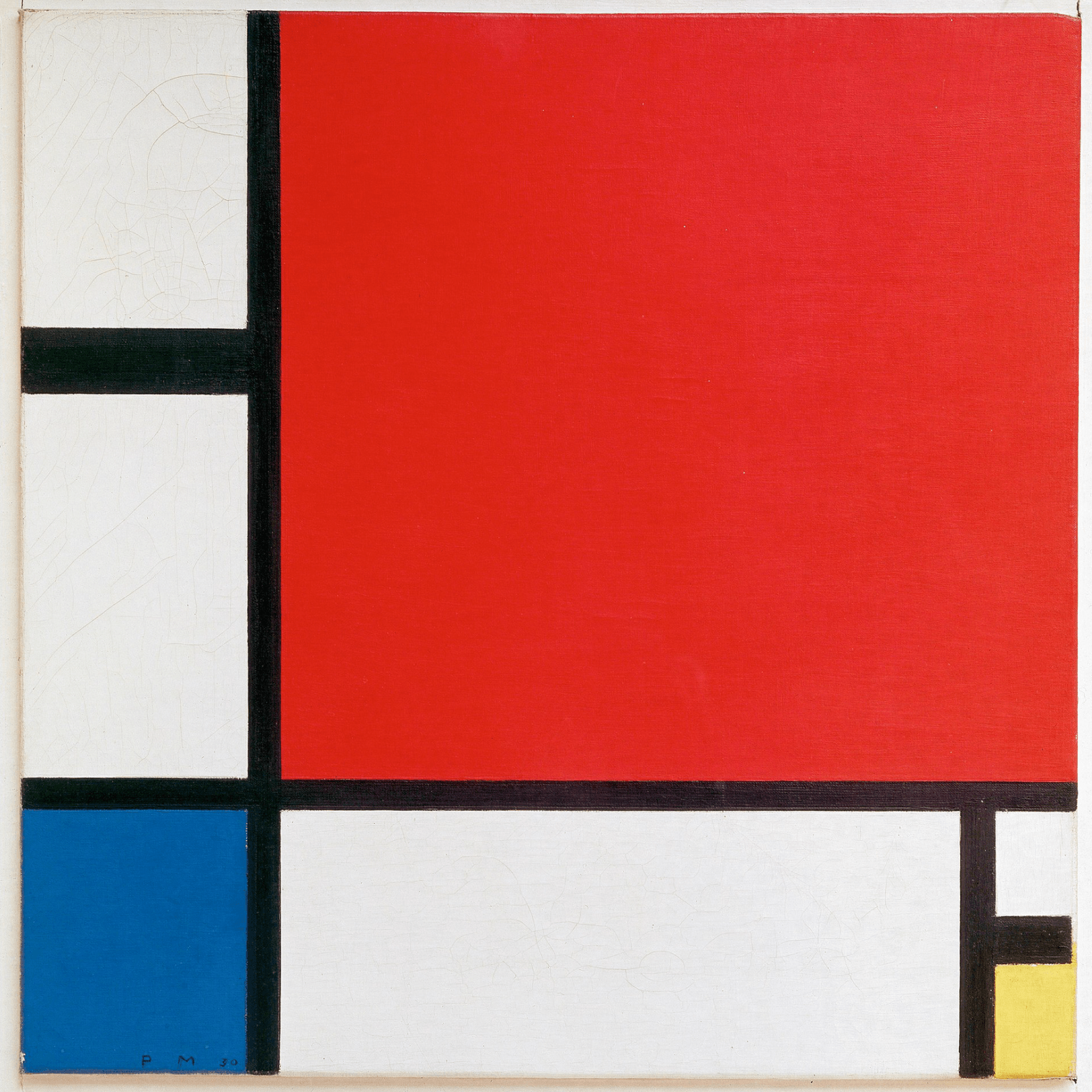
This logo draws on Piet Mondrian's 1930 painting Composition with Red, Blue, and Yellow. The abstract colors symbolize Tusk's diverse range of clients, while the lines represent communicating complex ideas simply. I designed it as a nod to Tusk's NYC roots, with an eye toward connectivity, balance, intelligence, and strength. Vibrant colors and dynamic contrasts reflect Tusk's energy and diversity.
Design Principles
Logo
- Movement to communicate agility and relentlessness
- Unity to communicate collaboration and care
- Balance to communicate smarts
Typography & Color
- Sleek lines and curves for smarts and innovation
- Powerful weight to demand attention
- Blues, yellows, reds symbolize policy, victory, and perspective
Design Iterations
Rounds 1–3
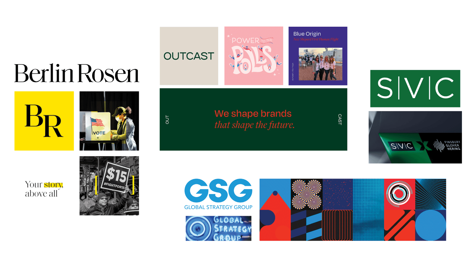
Round 1 Moodboard
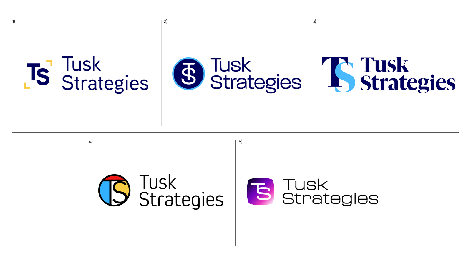
Round 1 Concepts
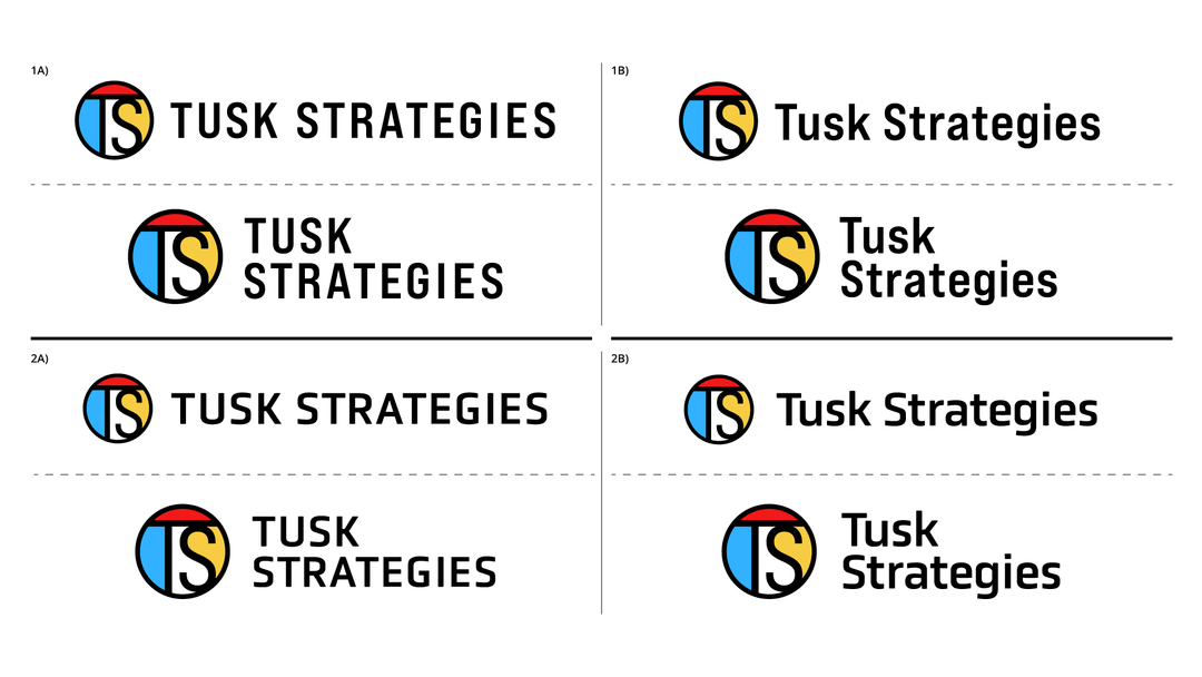
Round 2 Concepts
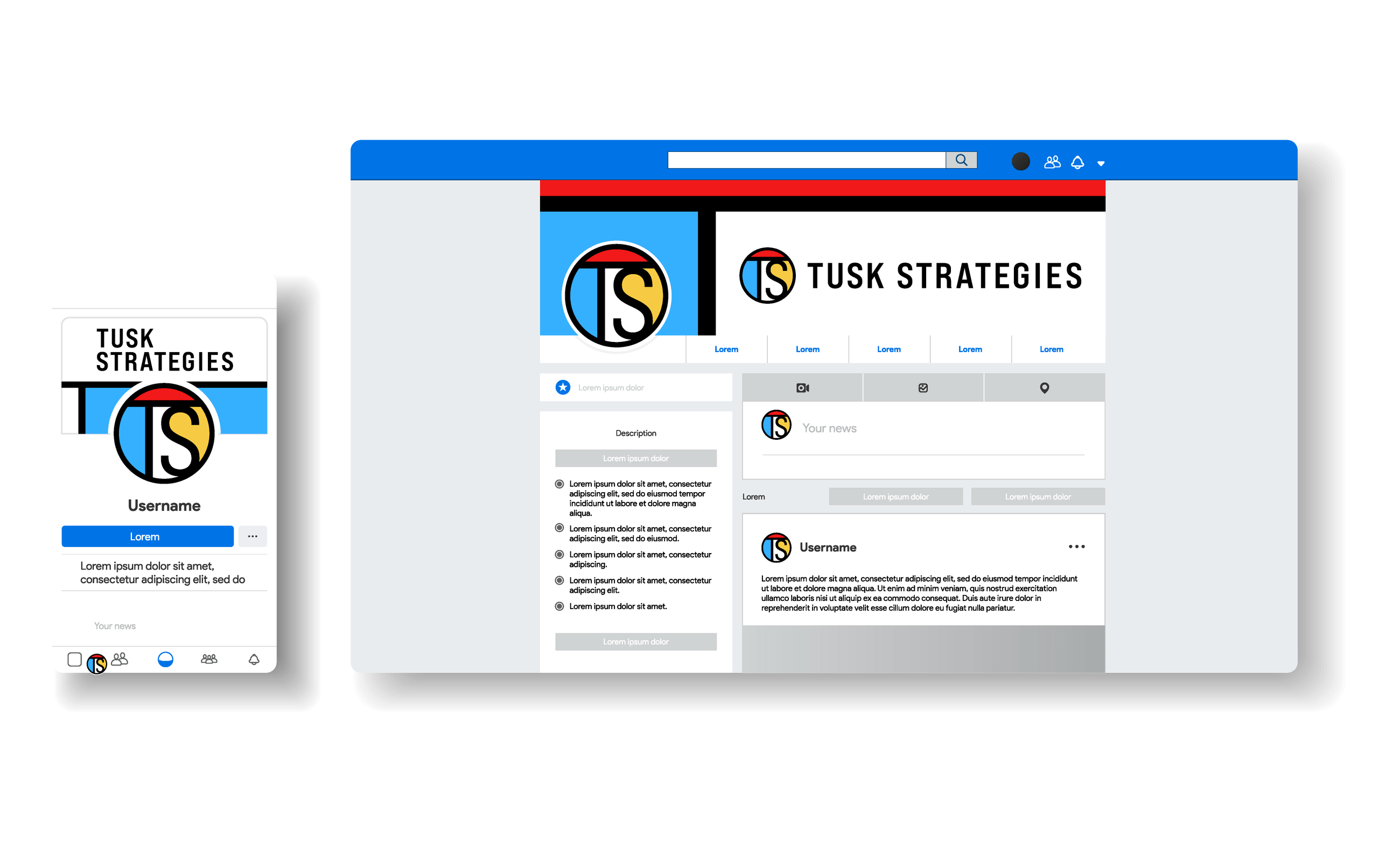
Round 3 Mockups
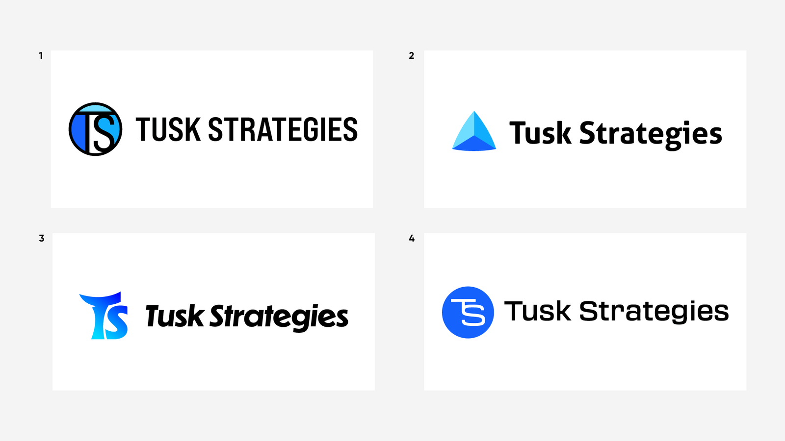
Round 3 Concepts
Throughout rounds 1 through 3, I honed the foundational logomark. In round three, I explored inviting blues and other directions. After feedback, I reverted to red, blue, and yellow: it stood out for uniqueness, memorability, and distinctiveness. In round four, I developed additional concepts, refined curves and intersections, and adjusted typeface leading to perfect the design.
Round 4
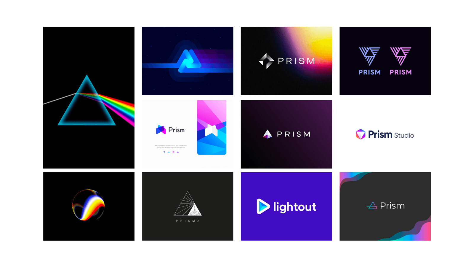
Option 1 Moodboard
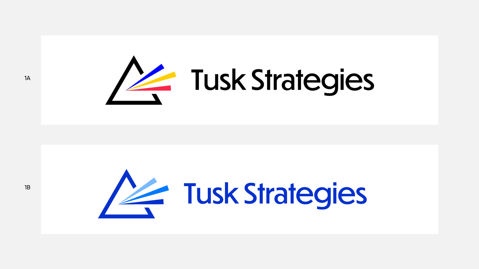
Option 1 Concepts
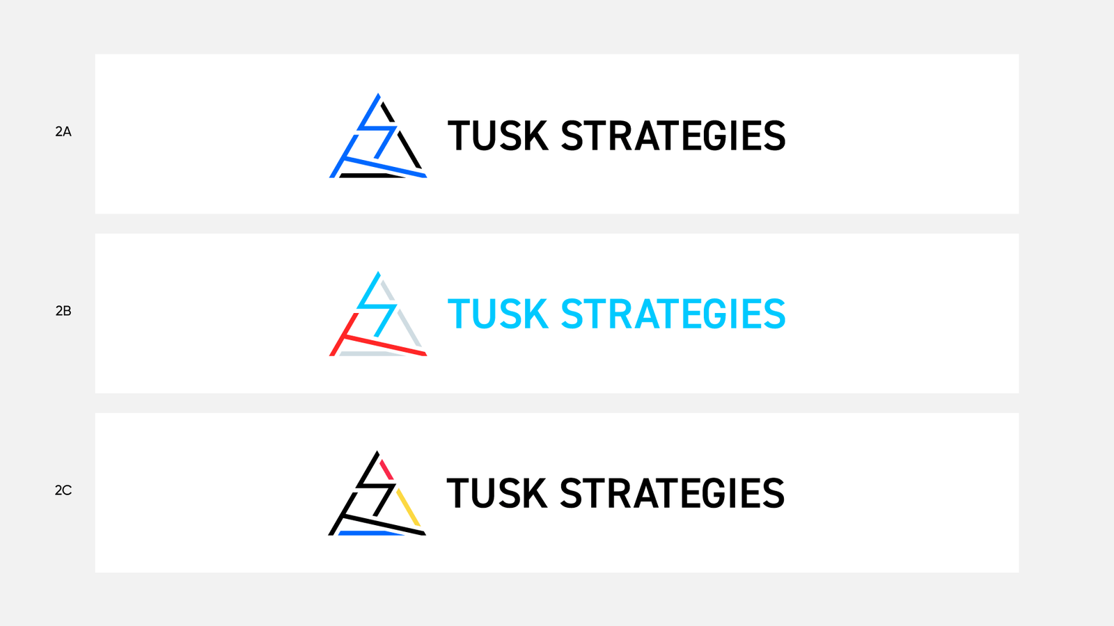
Option 2 Concepts
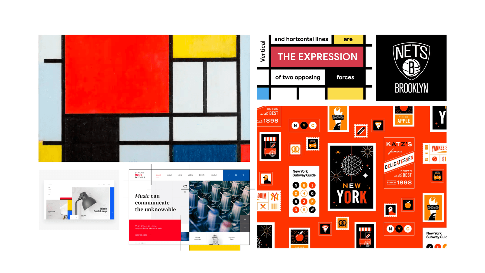
Option 3 Moodboard
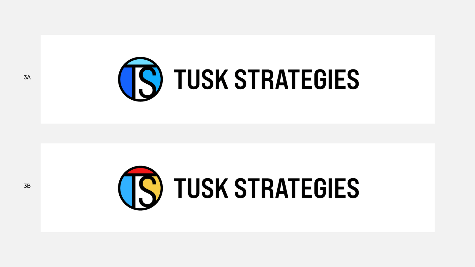
Option 3 Concepts
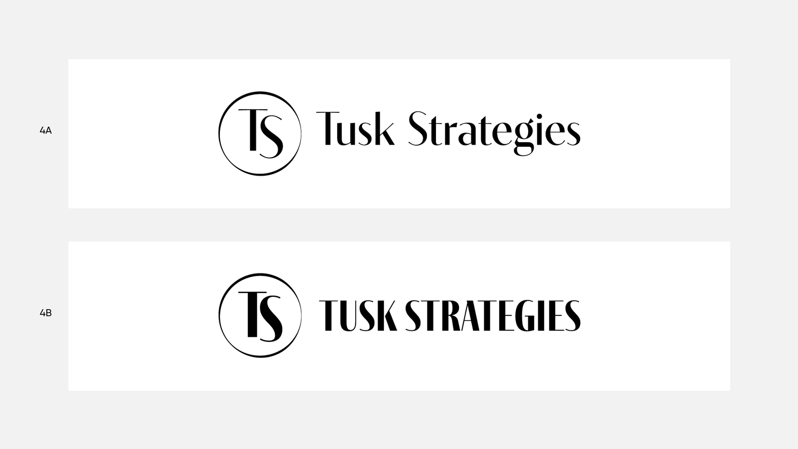
Option 4 Mockups
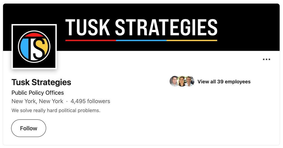
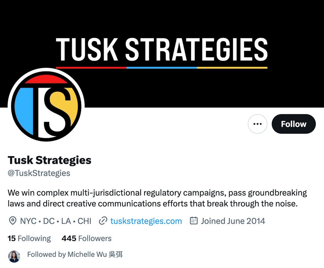
The Final Product

Conclusion
This project was a milestone in my design career: my first with full autonomy over creative direction for a complete rebrand. I'm grateful to Tusk for the time, resources, and budget to execute it. Creating a timeless logo inspired by Piet Mondrian made the journey rewarding, and special thanks go to Teal Media for their exceptional work on the new website.